Blog #3: Content for Optimisation
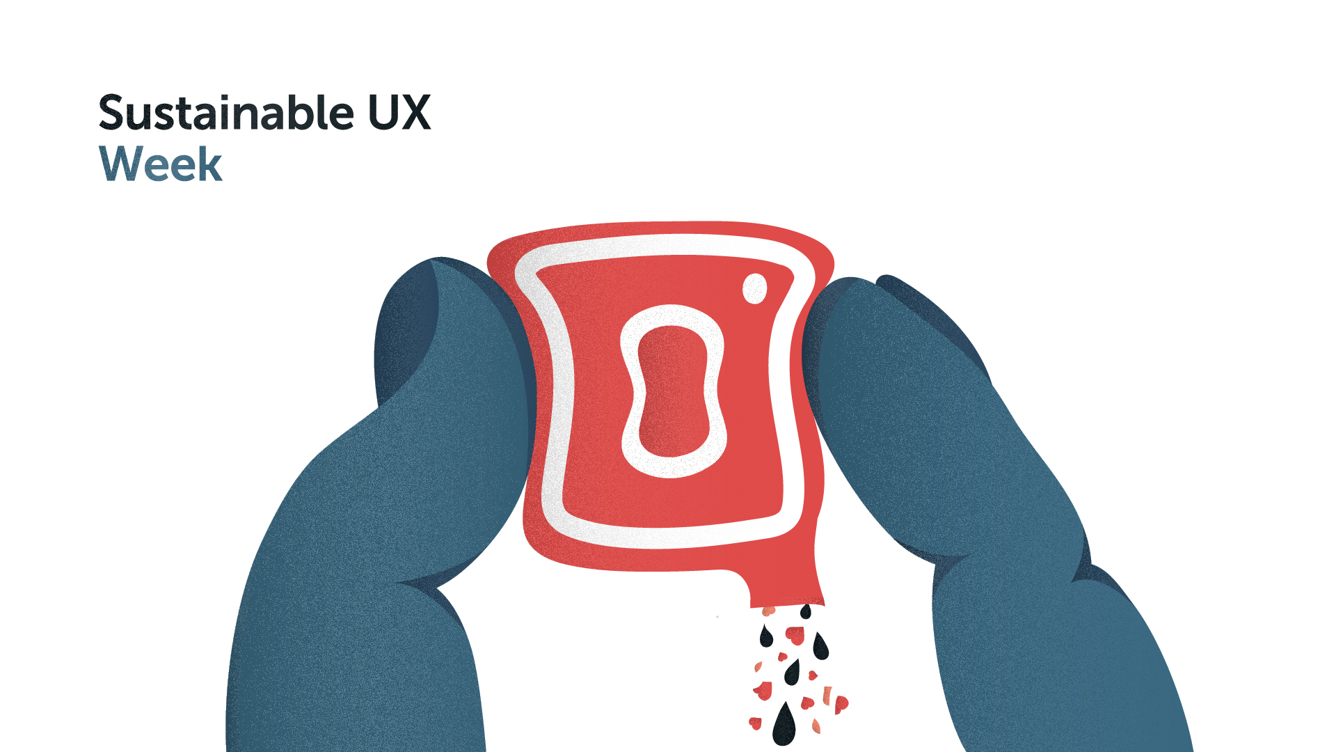
In light of Earth Day, we are dedicating this whole week to Sustainable UX. We do it so by showcasing some of the good practices already in place and by giving food-for-thought with our own ideas.
This is the third article in a week-long series about Sustainable UX. In the past two days, we’ve introduced the design movement that strives to lessen the carbon footprint of digital products, and spoke about how we considered it ourselves by adding small nudges to iMessage. Today, we want to take it a step further and discuss how we can optimise our content through design and aim for sustainability.
"Data is the culprit behind the monster carbon footprint of our websites." In their article, Sustainable UX design: saving the environment with smarter websites, the tech company Parker Software discusses their views on the impact of data on the environment. They see that the ever-increasing creation of websites is demanding more and more energy. By making the right decisions in our designs, they think we can improve this energy usage.
With every click to open a new page, your website becomes less sustainable, so it's important to make your content as accessible as possible.
Lost in the web
When users visit a page, all of the data on that page has to be downloaded. Energy is used to receive all the necessary content and present it on the screen. Depending on the goal of the user, all of that loaded data might not even be interesting for them, causing a waste of energy. Webshops, in particular, are notorious offenders. When you navigate to a specific item, you have to click through category upon category and retrieve new data every time. With every click to open a new page, your website becomes less sustainable, so it's important to make your material as accessible as possible. But, how do we ensure content is right there for the taking?
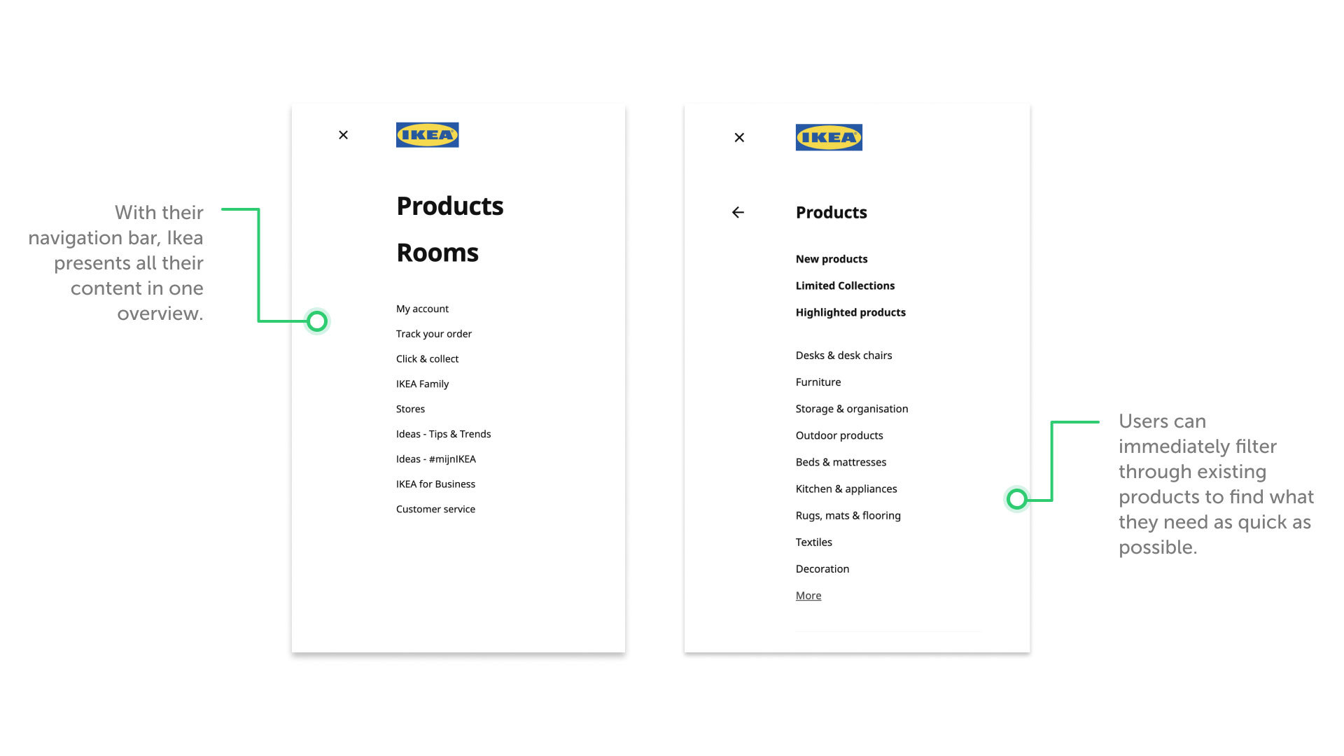
On their website, Ikea is tackling it well. With a clear navigation panel and suggested products when searching, users are able to find items they're looking for as quick as possible. Like in most webshops, Ikea uses the navigation panel to let their users filter through different product themes. From a UX standpoint, this is clearly done to make searching for products in a huge database easier. But, it also avoids the necessity to load in product data that the user doesn't want or need to see.
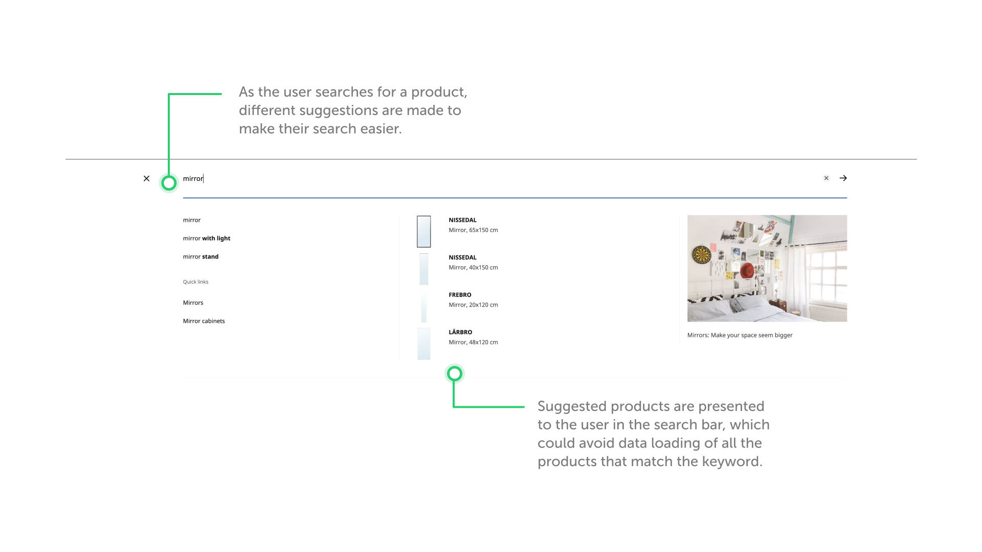
When typing a product into the search bar, the Ikea website automatically suggests popular products that match this search term. By immediately presenting possibilities for the user, they can find the product they're looking for even faster. With this, Ikea also avoids that users load entire pages of, let's say, mirrors and, therefore, an entire page of energy usage is spared.
Now make it smaller
Let's be real, does that small icon in your navigation bar really have to look that perfect? Who's going to notice it when the file has been compressed or if some pixels have been trimmed? To reduce the impact of our designs on the world, we need to start removing those extra bytes of data.
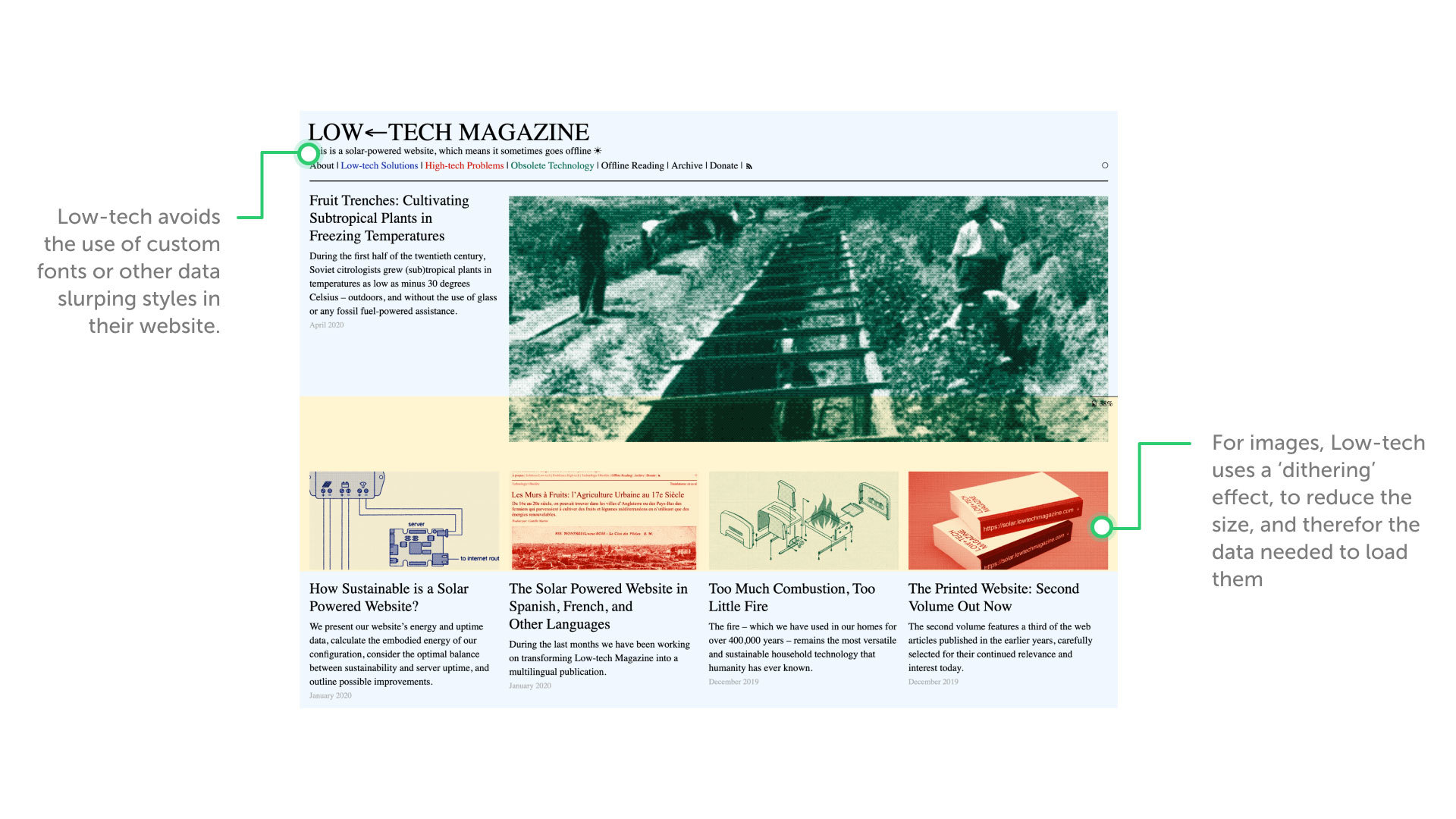
A company that is really aiming for the smallest content size possible is Low-tech Magazine. With their solar-powered website they try to "radically reduce the energy use associated with accessing [their] content". They’ve made several choices in design to reach this goal. The website is fully static, and so, asks for less computational energy to load, avoids custom typefaces and logos, and images are converted with a 'dithering' technique.
Our suggestion: An optimal filter for Instagram
The biggest culprit of our daily data usage might just be Instagram. With its ever refreshing images & videos, and its endless loop of stories, we're always loading in new content. With over a billion Instagram accounts and 500 million daily Instagram Story users (Instagram, 2019), that's a lot of data that the app is constantly generating.
In 2015, Instagram updated their standard 640 px square picture format in order to support the vertical and horizontal formats (16:9). Since then, an Instagram Story picture has the dimension of 1080 x 1920 px, and a maximum of 30MB in size.
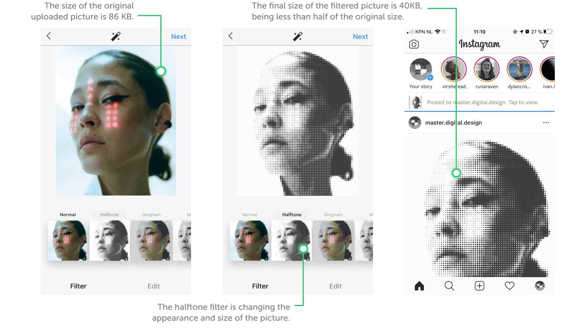
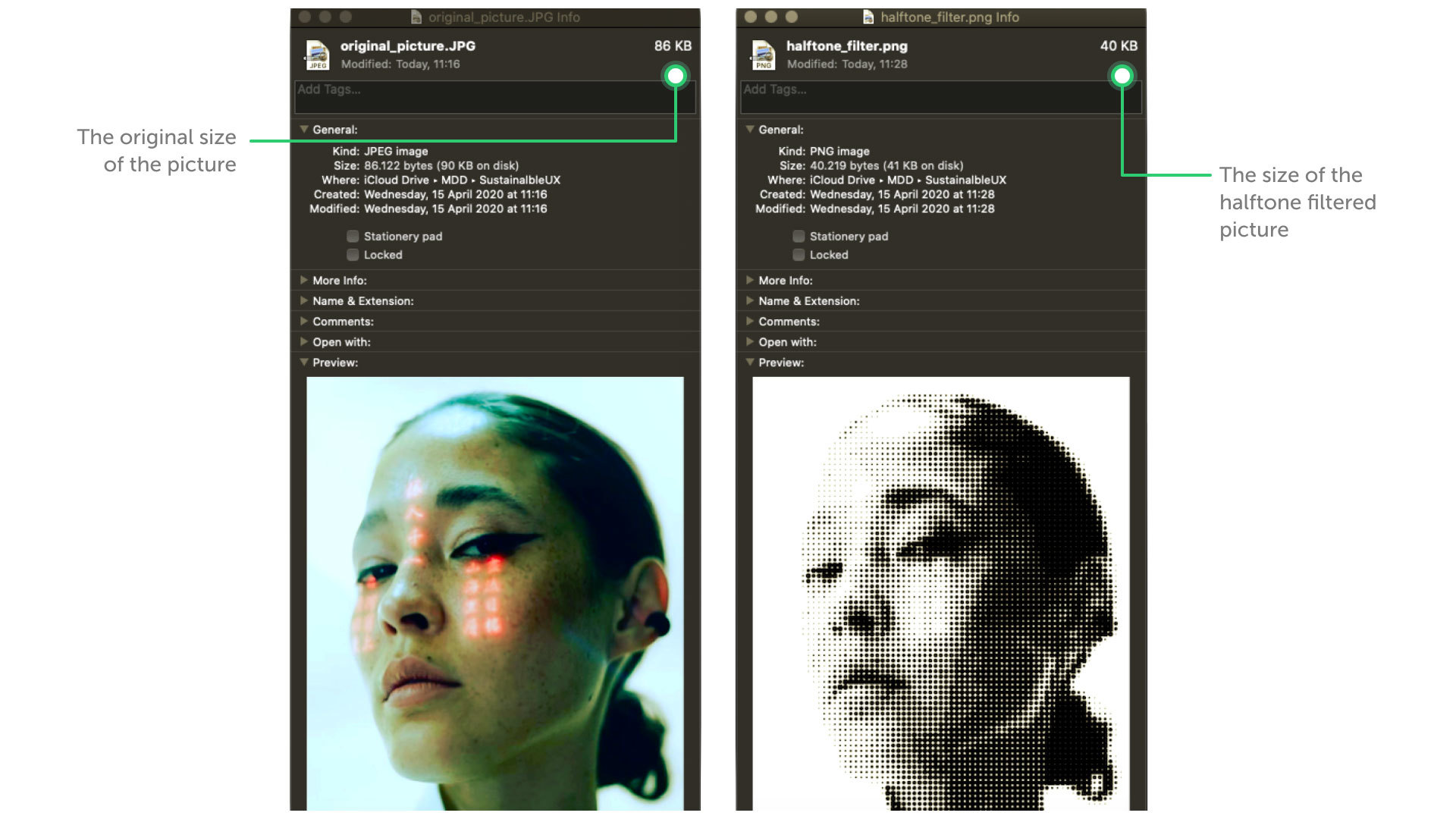
To reduce the size of the content shared in Instagram Stories, we created an environmentally conscious AR filter. For this, we were inspired by Low-tech Magazine and the way they dither images on their website. Our Instagram filter uses a halftone effect, which compresses images into dots rather than tones. A lot less data is needed to fill up the images, which makes their size significantly smaller.
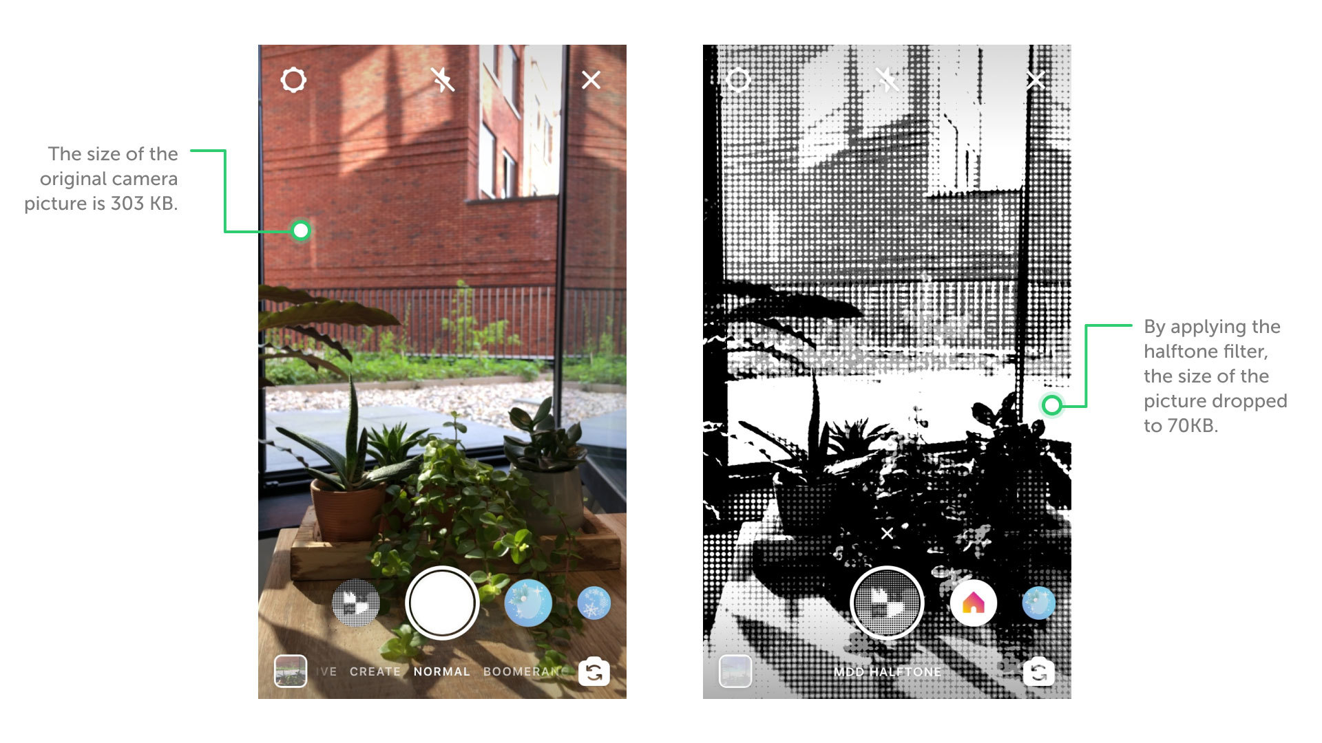
With the use of the AR filter, we want to reduce the size of the Instagram Story at the source. The filter reads and creates a dithered image of reality in which some pixels won't have to be shown. The result is a remarkably smaller filtered picture size than the original. In fact, by using our filter, Instagramers can reduce the size of their original picture by over 50%.
With the introduction of a new sustainable filter in Instagram, we might have users unknowingly become more sustainable. We don't have to push any sort of choice for them, but can simply make the filter available for them to use. Optimisation in content doesn't have to be thrown in the user's face. It can be done in the background and still make a big difference.
Good UX is Sustainable UX
In the article by Parker Software, it's proposed that badly executed UX design in a website could indicate that it isn't that sustainable. They might be right. A big part of good UX is making content easily accessible and speed, of course, plays a role in this. We see this too in the examples presented in our article. As designers, we have to avoid wasting the user's time with endless navigating or slow loading content.
With every design of a new page, we should be consciously considering what effect the addition of this content is going to have. First, the user's experience was our biggest motivation in this. How would people navigate to this page? How would they use it? Where could they go from here? Pages would be optimised to make the journey through products as easy as possible.
Now that we're actively, and almost naturally, making a seamless flow in our work, we could maybe take it one step further. How can we revise our work so much, that the impact we have on the environment is as little as possible?
More on that on our Friday blog.
Our Instagram Sustainable Dot filter is available on our Instagram profile page.
Text by Danique de Bies & Kent de Bruin. Illustrations by Matthijs Nolst Trenité. Filter and calculations by Gabriela Onu.