Colourblind Seer
A means to visualize how others see the world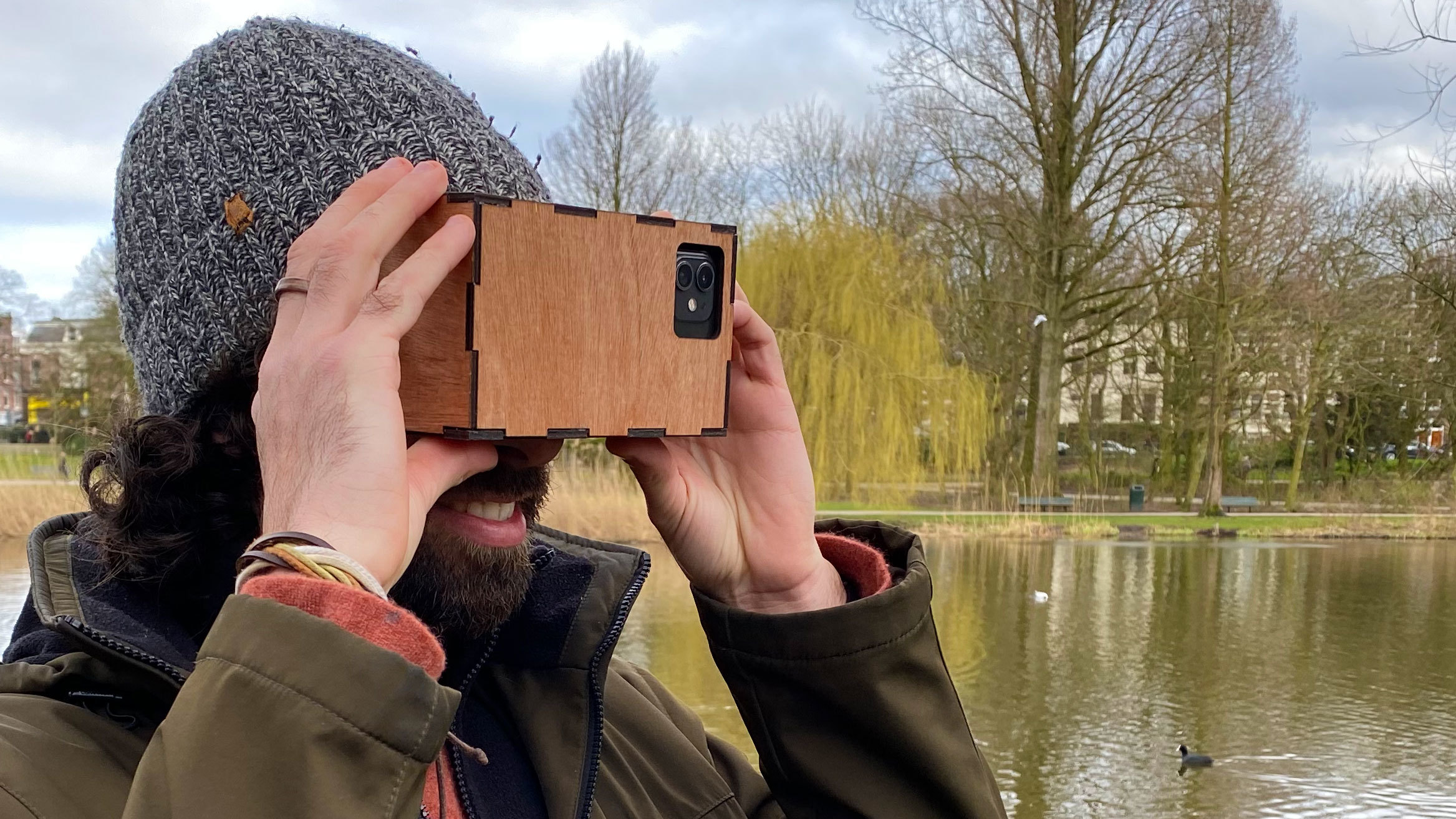
-
Client:
Personal Project
- Team:
-
Disciplines:
Experience Design
-
Schoolyear:
2020-2021
Colourblindness affects about 5% of the world’s population with varying degrees of severeness. You may have seen videos of colourblind individuals being given special glasses that allows them to see a fuller spectrum of colours. But for the other 95% I think it’s important that we understand exactly how this 5% sees the world.
Back in 2015, I sat down on my parents’ couch to watch an (American) football game. The game itself was unexceptional to me hadn’t it been for these special jerseys that each team was wearing for the game. One team wore a bright red jersey and matching pants, the other one was in florescent green. Shortly after the game starts, my phone buzzes from a group chat of close friends. A friend of mine can’t tell the teams apart. To him it looks as if they’re all wearing the same uniform and he resorts to increasing the contrast on the television to its maximum for little benefit. Colour is crucial in everything we design: from visual appeal to emotional trigger. As a designer, I support inclusivity. That night, I realized I had been lacking colour-awareness – an important knowledge to practice my craft in full.
Over the years, I discovered a number of online tools to help designers understand how their website and colour choices will be perceived by others. Colorblindly is a great extension for chrome to inspect your website and coolors.co will show you how your colour palette will look with all forms of colourblindness.
What was missing was a means for people to see the physical world as someone who is colourblind. Whether it’s an interior designer or somebody creating an exhibition space, they may not be aware of how their colour choices effect some of your audience. The interior decorator would be able to take into account how a space looks to another person. A visual merchandiser can pair colours that work well for those with a full color spectrum and those without.
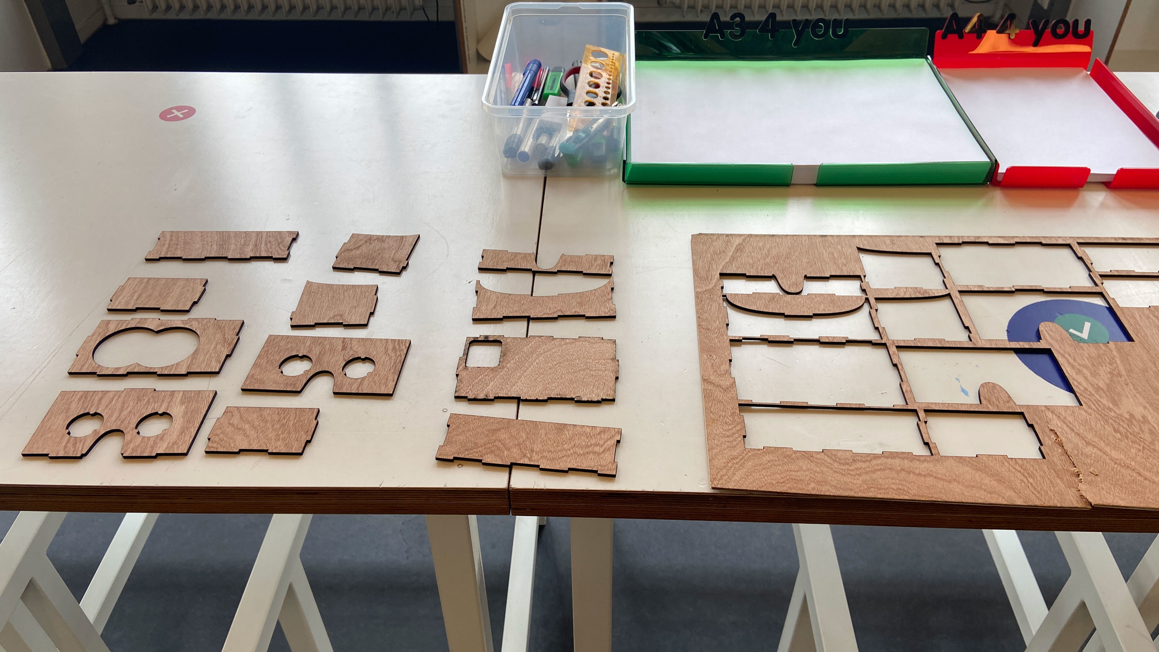
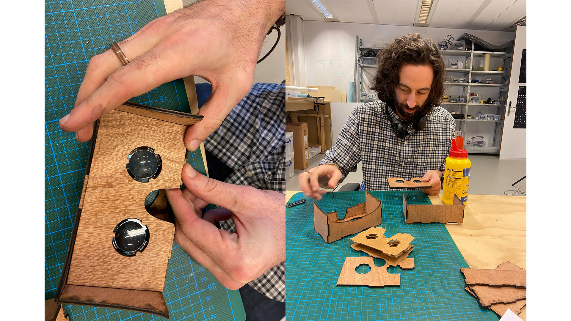
Creating physical glasses with lenses that filtered out light was out of my skillset and most likely beyond my budget. My next thought was to utilize google cardboard, an affordable VR headset that utilizes your phone as its screen. I initially probed Unity, a programme I was unfamiliar with, to find out that there were limitations to this approach. For one, I was hesitant to make an app as my preference was to make this easily available on the web.
Secondly, I discovered that within Unity you can only create Google Cardboard apps in virtual reality, not augmented reality. In order for this project to be successful it required utilizing my phone’s camera, so augmented reality was a requirement.
Swipe for the rationale behind Zachary's filter and viewer
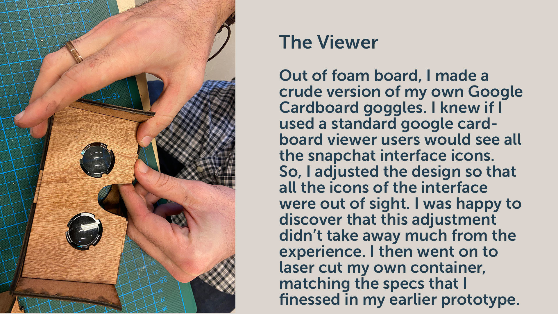
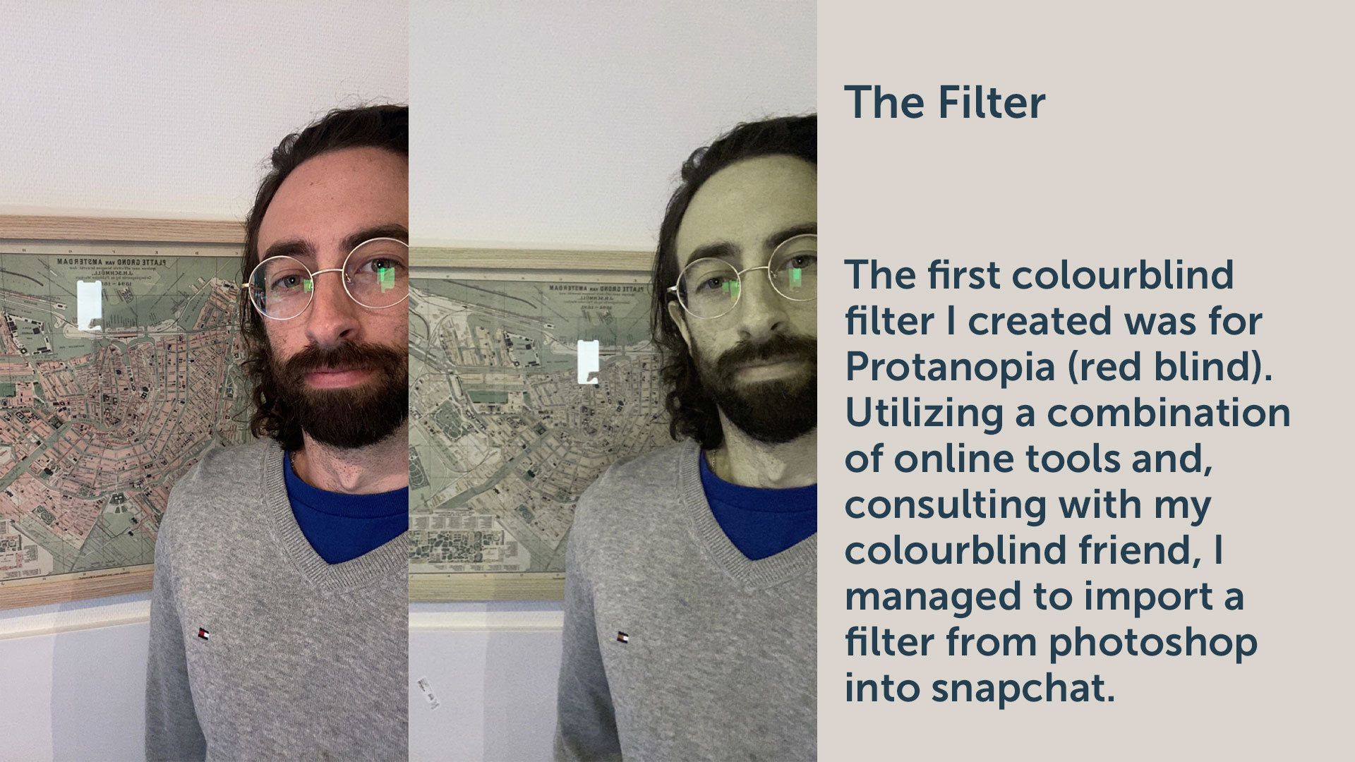
Wary of these concerns, I opted for a quicker hack. I figured I could create exactly what I needed in Snapchat via Lens Studio. To use the app, users can access Snapchat and place the phone in a cardboard goggle. The goggles are an important artefact as they help users focus and keep light away and from interfering in the colour spectrum users experience with the app.
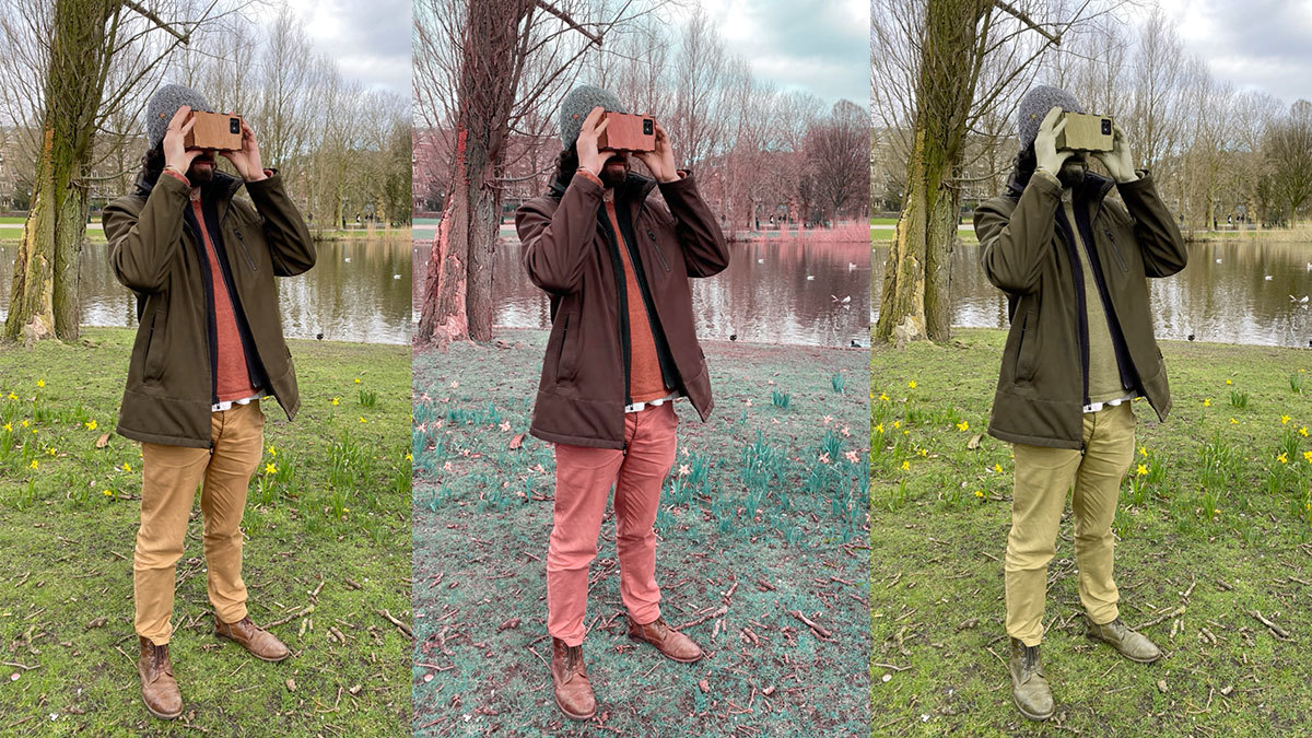
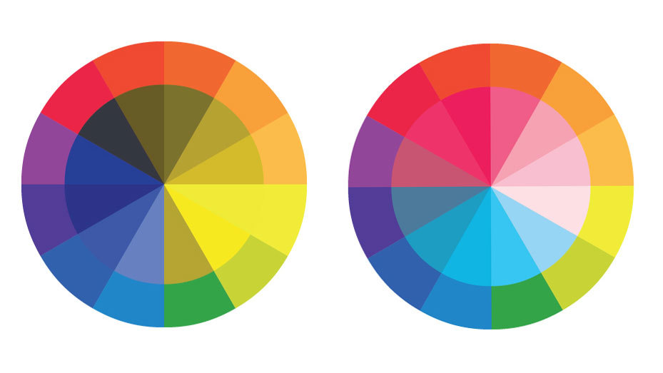
Next it was finally time to test it with fellow designers. Most seemed to be surprised as to what they saw. Some had an understanding of what it meant to be colourblind but couldn’t have imagined what it meant to see as someone else does. I set up a couple situations to illustrate the experience; observe a busy traffic intersection, find a red wire amongst many others, and construct a Lego creation. Many participants were surprised to see red and orange replaced with yellow hues. This reinforces the notion that you can empathize with a group but lack a detailed understanding of what it means to live everyday with colourblindness.
Watch designers testing the Colourblind Seer
After looking through the videos I had taken of the participants, I was surprised to hear an audible, ‘wow’. It’s only when you’re fully immersed and faced with a challenge that you begin to understand the problem. Those are the two elements that I believe truly raise the level of empathy (immersion and challenge). The container prevents people from looking away but it’s only when faced with a challenge do people begin to understand the importance of what they are seeing.
In the near future I plan to create the additional types of colorblindness as there are many with different severities. This project is completely open for anyone to experience themselves. If you’d like to laser cut your own container you can find the svg here. The colorblind filters for the container are easily accessible through this link. All you need is a snapchat account.