Some 'dark patterns' in UX

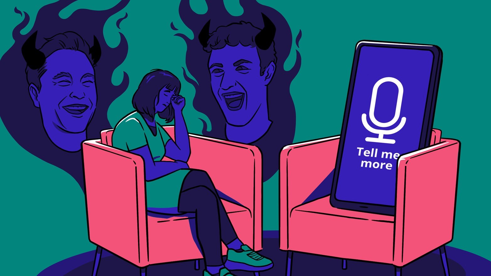
Good design is supposed to make users’ lives easier, their experiences more pleasant, and their work more effective. In short, a well-designed artifact should put their users in charge, giving them a sense of agency and control. However, not all design decisions are made with one’s best interests in mind: some, on the other hand, take control away from users, and mislead them. “Dark patterns” is the name that design practitioners have recently coined to indicate these unethical characteristics.
At the Master in Digital Design, I teach the Design Ethics course, and I have been wanting for a while to address this important issue. But I have been facing a dilemma of my own: in my classes, I have always made the point of balance practice and theory, and I just couldn’t find exactly the right scientific article to present alongside some applied exercises. Harry Brignull’s website darkpatterns.org is the go-to resource for practitioners, but which research paper should I pair with it?
Harry Brignull's slides. Credits: darkpatterns.org
Fortunately, at this year’s CHI conference, my good friends and former colleagues Colin Gray and Austin Toombs will publish exactly the paper I need!
What follows are five categories that Gray and colleagues use to cluster Brignull’s dark patterns.
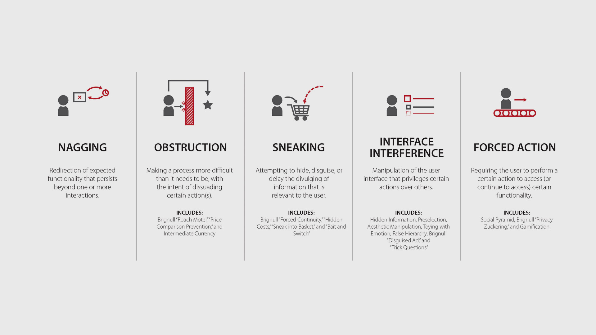
Nagging
Sometimes we expect an app or a website to operate in a certain way, but they temporarily do something different, usually to mislead the user. An unexpected dialogue box with confusing buttons is a good way to illustrate nagging - for example giving users only “OK” and “Not now” as option, without being able to permanently dismiss the notification.
Obstruction
An obstruction is a sudden interruption in the user flow, that temporarily blocks a function that one would expect to be there. This is often done to “lure” users into the system, and locking them in (often requiring a payment) after some time and effort has already been invested - for example “free” HTML editors that require a payment to launch a site, after significant work has already been put into it.
Sneaking
Some apps, sites, or services attempt to hide relevant informations from users, or to delay their discovery - usually revealing it only after an action has been taken. Shipping costs calculated at the very last second, or extra charges for a specific (and very common) type of credit card shown only during checkout, are a canonic example of sneaking.
Interface interference
We expect interfaces to follow well-established conventions: information should be visible, logically and hierarchically organized, and presented in easy-to-grasp aesthetic compositions. But, sometimes, interfaces are tweaked to favor one option instead of others, or to point way too much attention on one part of the message. A typical example are opt-out buttons buried under very long texts, and located in-between other checkboxes that are compulsory to activate.
Forced action
Sometimes, users are compelled to do something (often not strictly necessary) in order to “unlock” a desired function. I find it particularly interesting that Gray and colleagues include the “grinding” mechanics of some video games, when players are forced to repeat the same action - fighting an easy-to-defeat enemy - over and over again before being allowed to access some other portions of the game.