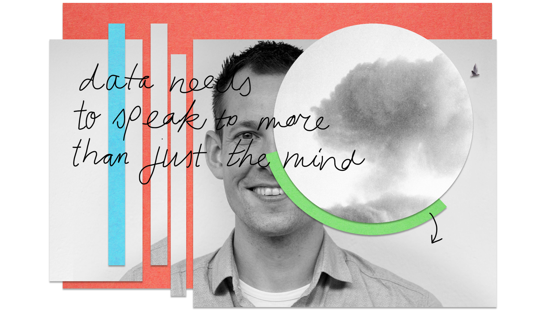
Interview Wouter van Dijk: “A dataset needs to speak to more than just the mind”
“Be careful what to measure and how to use it,” says design director Wouter van Dijk of CLEVER˚FRANKE in a conversation about data; about misuse, validating and the power of empathy when working with data. “You need context to read the data, to feel the data. That is when it becomes powerful.”
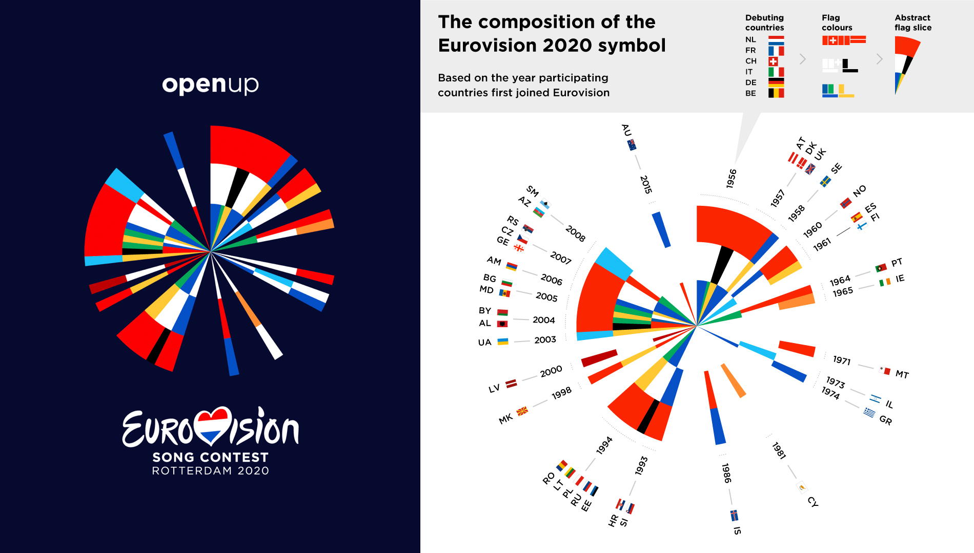
Over the past few years CLEVER˚FRANKE – ‘a data design and technology company’ – has created design solutions for a vast range of clients. Ranging from agriculture (Aker) to festival culture (Eurovision) and from digital ecosystems that measure trends in the music industry to personalized data experiences with the help of knitting.
Master Digital Design student Astrid van Rooij spoke to Wouter van Dijk about the studio’s data drive.
Astrid: At CLEVER˚FRANKE data is the core of every design. Can you approach every topic with data?
Wouter: “There are a lot of limitations to data. Most importantly, you need to be careful what to measure and how to use it. A lot of data is being misused.
For example, I was watching this television documentary ‘Klassen’ about primary school children and their educational level. And at a certain moment they used this infographic, this chart, where they calculate the children’s skills in mathematics and reading. This data is quantifiable: you can calculate reading skills in various ways. The data also has granularity: some students do the practice every day. So, you can see progress and trends: after summer holidays the students’ levels decreases a bit and is picked up again later. It’s wonderful data, but those measured skills are only a small aspect of growing as a person. When preparing children for society, there a lot of aspects that are not quantifiable. For example, how do you manage yourself socially within a group? Such emotional skills are important but difficult to quantify. Nevertheless, the easily quantifiable things are put on a pedestal.
The chart also had coloured bands that showed the national average of all students within The Netherlands. The top band was green, then a slighter green shade, and then below the average it became orange and red. This is wrong, because why do you compare this child to the average students? If you do so, 50% of the children you compare to in this chart are in the orange or red band. Are those children not good enough?
As a visualization designer and a parent, it annoyed me. I emailed them to explain that some students read faster or slower but that is just normal distribution. In every natural process there is normal distribution. It’s normal, it’s okay! You are not good or bad. They emailed back that I misinterpreted the chart because “red is not necessarily bad”. Well, as a designer I am not so sure about that. Sure, there are cultural connotations, but we all know the meaning of green and red, right?”
A: Does this mean that some topics are not fit for data-driven design?
W: “Not when you solely focus on the data – then, it is limiting. At CLEVER˚FRANKE, we like to work with students on their student projects. And more than often, those students want to tackle societal problems or issues with data. Yes, you can create awareness by looking at segregation in neighbourhoods, income gaps, educational gaps, and changes in poverty.
But many of these things we already know, so just the data does not really give true discovery, but it can create a sense of urgency or foster societal ideas when put in context. You do not only want to read data, you want to feel data. That is when it becomes powerful.”
A: So, you need to add emotions and feelings to this data?
W: “For sure. Data is very analytical, very theoretical. When using solely data you are not speaking to a whole person. That’s when design comes in. Design can speak to the guts, to your hearts.
That’s why I strongly believe in the user-centred design approach we work with. Not data-centred. People come to us for data visualization but in the end, we're not designing to provide the best data illustration; we're designing to get people to change their behaviour, to get a new insight or to change something in their job or in their life.”
A: What does this data look like when it lands on your desk?
W: “It comes in many forms. It can be big datasets we cannot even go through ourselves or an API with a live data stream. But it also happens that we start with a small Excel file with just a few rows with descriptions and thoughts and the question to us being: “Can you visualize how our projects are going?” In such cases the data is not the core at all but just a way to start talking and working together to see what we can measure and what we find relevant.”
A: How do you validate all the data that is provided to you?
W: “I’m inclined to say: we don’t. We can’t. Usually, we work with terabytes and terabytes of data. There are massive teams behind that. Gathering, collecting, storing, it’s a whole field of expertise. We can do such jobs for smaller projects, but for bigger ones we rely on the company’s data team.
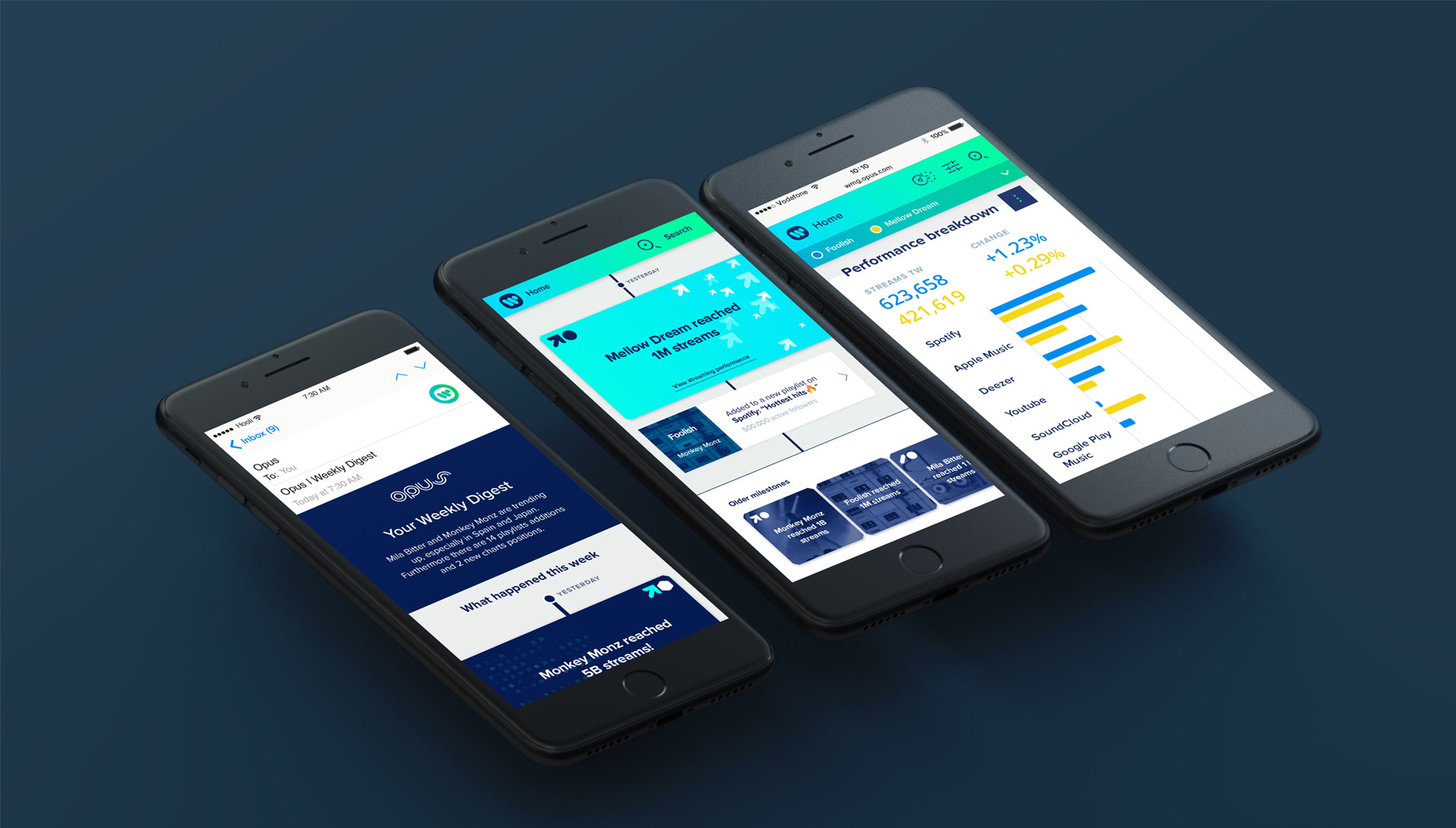
An example: we worked on a music performance dashboard for Warner Music Group – one of the top three music labels in the world – to make it easier for managers to look into the performance of artists. One data set contained every single stream by every single person every day. An unbelievable set of data. Honestly, I would not want to be responsible for having the label manager of Ed Sheeran act upon the wrong data that is provided by a small studio like ours. I prefer an external data team then.”
A: How does CLEVER˚FRANKE enter a project like the Warner Music Group project?
W: “We start with talking to our potential target audience – different data officers of Warner Music Group (WMG). We sit next to them and monitor how they go through their day. The tools they use, the websites they visit, the playlists they scroll through. We see them checking released albums or what is going on at Apple Music. They put their findings in Excel sheets and email them to the people that need it. From all of these observations we made a massive inventory to see how we could make their jobs more efficient.”
In the end, people are not that smart. Computers are smarter, so anything we can do, AI can do too.
A: That is a real human-to-human approach. Is working with data preferably a human job or could you also rely on AI?
W: “In the end, people are not that smart. Computers are smarter, so anything we can do, AI can do too. Yet, for a correct analysis, you need a lot of contextual information.
Data can be incomplete, for a reason. For example, with the WMG project there could be delays in data of streamed music. You have to know, there is a lot of politics in the music industry. For various reasons, data might be delayed a few days. And then all the streaming data of the artists take a dip. A computer does not know that the dataset is incomplete, but we do. AI does not know the context of politics or other personal experiences. A crucial question to always ask yourselves: What does this data tell me and what does it not?”
A: And then you have to turn that data into something comprehensible and visual…
W: “Exactly. Data is just one tool in our toolbox. Now it is up to design and creativity. We have to figure out how to present the data – while keeping the users in mind. Do we want low level data or aggregate data? Do we want to highlight changes or differences? This is when the data enters the creative process and we turn them into designs and sketches. Figuring out how data can tell a story.”
A: Is there a protocol for keeping that balance? What are the boundaries of complexity?
W: “No, if you have a protocol, you need people that want to follow protocol. Designers don’t like checklists. So, we make such decisions based on our knowledge base, experience, and reading materials. For example, on handling colour-blindness, text length, different languages... But, in the end, designers just want to go about it and run into mistakes too. Or notice that we have tackled certain things before and can do it that way again.”
A: What is the key thing from a user perspective to make it an attractive visualization?
W: “A database needs to speak to more than just to the mind. It needs to be more than analytical. Firstly, you need to make people intrigued and impressed by data. And then you need some layering. So, at first, it is about providing an initial “Wow!” but also a “What is this actually?” - a trigger for people to get into it and to start reading. But they don’t have to understand everything in one glance. That is rarely the case. It is nice when people can comprehend it, but there has to be more layering to it to make it really interesting.”
A: What are the metrics to measure if a project is a success?
W: “User experience is difficult to measure. You can measure user experience if you have a website or an application where the goal is fairly clear. For example, Booking.com is a terrible yet interesting example. They don’t seem to care if you were satisfied with your visit, if your user experience was good. Their only goal is conversion, which they can measure well.
Many aspects in visualization are difficult to quantify. A few years back, we worked together with data visualization specialist Andy Kirk, who was doing a research project on the perception of data and whether people were able to successfully read data visualizations. They did this study through surveys, interviews, groups sessions, individual meetings, discussions, etcetera. A whole scientific endeavour, which is very interesting, but not feasible for us. It's not realistic to do that with our projects.”
A: When looking at the visual identity of the Eurovision Song Contest 2020, I know how brilliantly that design was made and how data formed the base of it but I cannot see the initial data any more in the outcome. Does that data still matter?
W: “Yes and no. I think it matters. It is the same as art. When you say: “Any kid could draw this,” well, it might look the same but that children’s drawing does not mean the same. I think that knowing that something has meaning or data behind it, can create an emotional response or connection.”
A: When CLEVER˚FRANKE decided to go for a data driven direction in 2010, it was a remarkable and innovative choice. But right now, data is everywhere; we measure everything: sleeping, exercising, menstruating, and even our happiness. Is there a risk in datafication of every aspect of life?
W: “Always. Tracking your menstrual cycle can be interesting. If you are trying to have a baby it is good to know about regularity or frequency – to know how difficult it might be to conceive.
On the other hand, when pregnant, you can strap a band around your belly to monitor the heart rate of your unborn baby. That plays into the emotion of parents wanting to do everything they can. But how actionable is that data? In the best scenario, it puts you at ease. In the worst, it will get you worried every time you hear the rate drop a bit. But the heart just still needs to find a rhythm, you know. So, is this scaring you or helping you?
The same goes to measuring every millilitre of milk consumed or every dirty diaper: does that make you a better or happier parent?
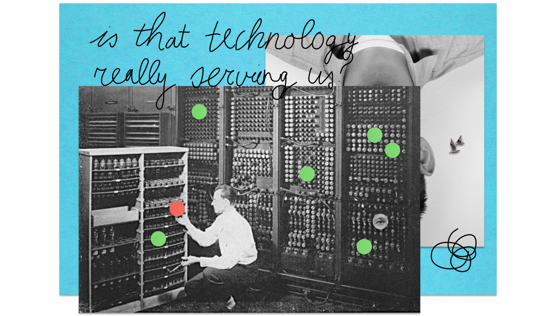
That is why you always have to question: is that technology serving us? Or are we serving that technology? That also goes for data. Currently, there is a high demand for media. People want to consume media all the time. We are attached to our phones, constantly checking news feeds and live blogs. Data will just become part of that, because it is another source of media that we can consume. I think data is being misused for content creation, but not necessarily from a user-centred perspective. I think there is a lot of power in data, but it can also be entertainment.”
A: On the other hand. Is there something you would still like to measure, or a specific piece of data you are curious about?
W: “I am intrigued when data is counterintuitive and tells us something we don’t know. A common mistake people make when you ask them to make data-driven policy or do data-driven storytelling is that they look for data that supports their message. But it should work the other way around: data should be your start.
When looking back at my example about the primary school documentary “Klassen”, I can also see a great example of the use of data there. They showed that people with lower social economic status get an educational advice that is lower than the scores of their actual tests. In this case, the data on scoring is more reliable than the teachers’ advice, or at least less biased. You need researchers that aren’t biased towards proving their point or supporting their policy with a data find.
So, to answer your question: I couldn't tell you what data I would want to find because I don't know which data will tell us something new.”
This interview was the result of a joint event by the Master Digital Design and Dutch Digital Design.